Images in Webflow
First off, there’s no way you’re not familiar by now with using bits and pieces of Webflow SaaS to perfect your very own web page. You won’t go wrong with choosing Webflow web builder since it has many fantastic features and intricacies to meddle with.
One of those features is the Webflow images, and as with every other feature, you can put your mind at ease because you won’t need any coding, to begin with.
However, as easy as it may sound, many web-building fanatics are eager to make their own site as fast as possible but clearly lack the information about how to incorporate images in Webflow.
That’s why we are here , to point and guide you through every step of the way toward utilizing Webflow images to the fullest extent. So let’s begin, shall we?
Adding Images in Webflow
You’ve got to start somewhere to get a grasp of how Webflow images work. And there’s no better way to start than adding images in Webflow.
Firstly, you need to know that a background image of another component and an image component isn’t the same thing. An image component in Webflow is its own thing, whereas an image background of another component is incorporated through the given component, for example – a Div block.
Basically, there are 4 individual ways you can add images in Webflow to breathe life into your web page.
- The first one is straight from your computer;
- The second way is out of the Elements panel;
- The third way is out of the Assets panel;
- And the last option is through a Quick find search.
Choosing one option over the other is a matter of preference. Do remember that an image placeholder can be put anywhere you wish and is not static, meaning that if you add it in the wrong spot, you can easily alter your decision and move it elsewhere.
Now, let’s see how you can add images through each and every option listed.
Adding Images From Your Computer
Now, you definitely know how the drag & drop function works on every PC or laptop. Adding images from your PC or laptop is done by dragging the image of your choice into the Webflow canvas and simply dropping it wherever you want it placed. This is the least confusing way to add images in Webflow.
Adding Images From the Element Panel
The Elements panel is located on your left side when you click on the “Add” button. The “Add” button is situated on the top left corner and it’s the first element you’ll see. When you take a peek at the element panel upon clicking “Add”, you’ll see the “Image” option that’s located on the bottom of this panel.
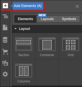
All that’s left is for you to Drag & Drop the “Image” icon wherever you find it suitable. When the placeholder image is set, you’ll find an “Upload” option, and by clicking on it, you can select the desired image, and you’re done! After that, all that’s left is for you to choose the number of pixels for height and width. Or, you can just click and drag the corner of your image to resize it however you want.
Bear in mind that when you do the resizing, you can’t go over the limit specified for the parent image. On the last note, the HiDPI option is next to the height pixel value option, and by clicking on the option, it will resize the picture to half of the previous pixels. HiDPI displays such as a MacBook work wonders with this resizing.
Adding Images From the Asset Panel
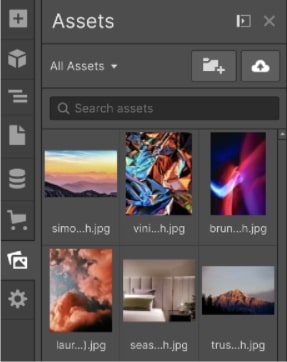
The asset panel is situated as the fourth one from the upper left corner. When you’ve clicked on the Asset Manager, you can add a file by clicking on the upload option located just right of where it says “Assets”. After that, you can upload any image into the asset manager itself and just drag & drop the image onto the canvas that you’re working on.
Note that while you add photos into the Asset manager, Webflow will produce responsive variations of those images. Nonetheless, optimizing your photos before uploading them in Webflow is a must.
Adding Images Through a Quick Find Search
Inside the Webflow Designer, you’ll be able to find a superb bar for searching called the Quick Find Search. It will basically aid you and practically speed up the process of your working and increase productivity while you’re working. It’s simple to add an image through the Quick Find Search, and that’s simply by putting it on a function through CMD+E or CTRL+E.
Replacing Images in Webflow
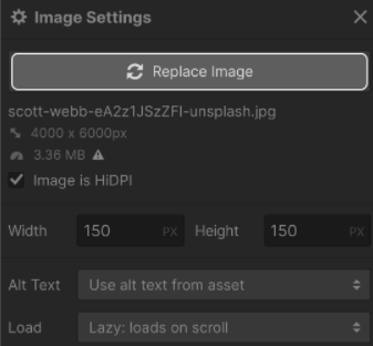
If you’re not satisfied with an image in Webflow, you can replace an image placeholder with the appropriate image of your choosing. It’s really straightforward, all you have to do is go to Image settings and select the “Replace image” toggle which will lead you to the Asset panel. After that, select which image you’d want to replace the old image placeholder with, whether that’s uploading a new one or an existing one, and voila!
Styling Images in Webflow
Now, about styling images in Webflow, you can do so by just utilizing the “Style panel” and you’ll be left with styling photographs like other elements in the exact same manner. Some design settings like “Background styles” may not apply to photos, however, you can utilize background pictures rather than overlapping them.
The best and easiest way to design your images is utilizing the “classes” option since it saves a lot of work, and you may use it for designing a group of photos at once. Whatever you change into the group of photos, it will apply to every photo that’s selected. If you want to determine the size of the group images, you’ll find that using the “Style panel” is far better than the “Settings panel”.
The “Style panel” offers numerous functions to work with, and it’s a superb way of getting every bit and piece of your Webflow images to look like how you intend them to. You can adjust the border or margin radius on each of the image’s corners, supervising and controlling the outside boundary space it has. Additionally, there’s the “Drop shadow” option, allowing you to manage your photos to appear as they’ve burst outside the page itself. And if you want to style the photos even further, you can do so by adding various filters like sepia or you can blur it out – it’s your image to meddle with!
When you switch the size of your image from this panel, it will immediately overrule the size options from the “Settings panel” that you’ve put in. Just a friendly reminder that if you’re uploading an image, Webflow retains a 4MB maximum storage capacity for image files.
Including Alt Characteristics For Images in Webflow
The Alt characteristic is used to display alternate text if the image happens to not load properly on your website for whatever circumstance. This might be a quick summary of the image at hand since long texts don’t get along with pictures. The Alt characteristic is useful for both usability and determining whatever the photo is really used for in any search engine.
You can gain entry on the properties through the “Settings panel” where you can find the Alt characteristics in Webflow for your image. There’s a dynamic value in the Alt characteristics section where you can utilize an image element through dynamic templates and lists.
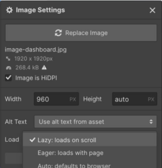
To get a better overview of how this is done, you may simply choose a picture, then navigate the “Settings panel” and check the box next to “Image properties” that says “Get alt text from”. After that, choose an area where you can store the alt text for your photos.
Utilizing Webflow Images
While adding images is of course step 1 with getting to know the functionality of them in Webflow, the second step is most certainly using your images. Overall, there are 2 methods to use pictures while working with Webflow. The first one is using them as so-called inline images, and the second is using them as background images.
On the inline images, Webflow will seamlessly adapt and produce variations of a given inline picture at multiple resolutions immediately after you’ve put an inline image on your page. Then, whichever browser you’re using will deliver the optimal picture according to the screen resolution on the screen of the recipient who sees it.
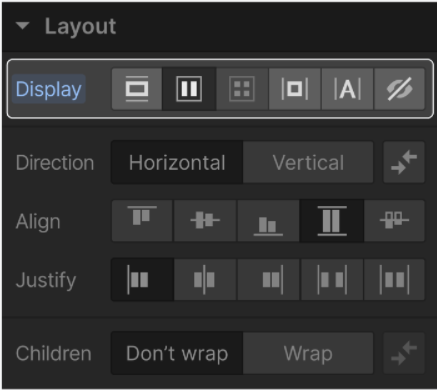
As for background images, only the original picture is utilized instead of the responsive version. That’s why there’s a reason you should be searching for the perfect resolution for the image before you even begin to upload it. First off, see what’s the most frequently-used and practical screen while keeping the user as well as their displays in mind.
For a MacBook Pro, that’s 15” wide, you might need a picture of roughly 3,000 pixels since its resolution is 2,880 x 1,800. Take the average case in mind and it’ll look good on wider screens also.
Image Fields in Webflow
An image field is more or less a Collection field feature that enables both your colleagues and you to submit and utilize images to be set as your Collection packs. Collection photos may be utilized as a standard photo component or as a background photo in “Collection Pages” and “Collection Lists”.
Filtering a “Collection Field” is done through these Image icons by filtering them or making components in the collection pages and fields conditionally visible. You can do this by selecting an Image field from the “New Field” drop-down menu inside “Collection settings”.

If you want to add some more images into the image field, you can do so by dragging and dropping a picture into the CMS or just clicking to upload a brand new one. Any picture file type that is permitted by Webflow can be added to the image field. And if you want to link a certain image field to multiple components or even Image styles, you’ll be able to do it through whichever Collection List or Page you want.
Image fields also work with dynamic Alt attributes. You may add text to it by selecting the wanted photo, then through the Settings tab and in image properties, you’ll find a “Get Alt Text From” button. Select this box and the image field having the alt text that includes every image in it, and you’re good to go.
Toggling Between Responsive Images
Responsive images in Webflow means that it generates alternatives to your submitted photos to ensure that they’re responsive, attractive, and run smoothly on each and every device. It actually speeds up the loading of your mobile sites, tenfold.
Simply said, setting every image as a responsive one will make your browser deliver another sized variation of the picture depending on how large it is on your designated web page, and from what’s the actual pixel density on your screen. Webflow does this by creating a collection of variations about every picture when you upload it while encoding information to your computer browser about when to switch between versions.
Webflow is great and includes Responsive Images from the get-go, but sometimes people need to add other images without them being responsive. To switch off the Responsive Image function for a particular picture, you need to press CTRL+SHIFT+O on a Windows computer, and CMD+SHIFT+O for a Mac. When the options windows for that particular image appear, you need to select the checkbox to turn off the Responsive Image option.
Webflow Images: Putting Everything Into Practice
All in all, this is what you should be looking for when working with images in Webflow. Always remember that Webflow has responsive images set for almost every image, except for the background images. That’s why you need to set what pixel amount the image needs to have before you upload it since the display has a different width size.
About adding and replacing, it’s as simple as dragging and dropping the image of your choice, while you may follow it up with an Alt text to make it look a lot better. And if you want to use more images at once, the “Style panel” and Image fields work the best for this.
